Cisco
Client
Role
UX Designer
Year
2022 - 2023
Overview
What are the results that we achieved?
01
Improved product cohesion
The redesigns improved the coherence of the product suite. Positive feedback suggested that the interfaces felt more interconnected, potentially enhancing the perception of the suite as a unified offering.
02
Created a framework for iterative designs
Feedback from the product teams and stakeholders highlighted a notable improvement in the user experience. The redesigned interfaces were described as more intuitive with the application of the design system.
Testimonial from client
Overview
“Jordan is a thoughtful talented designer who played an instrumental role in Cisco’s XDR launch. I always had confidence Jordan would be sending us great outputs to leverage. Jordan conducted audits, worked within a wip design system to apply to a highly technical application while partnering with our UX team. Thanks Jordan!”
Background
Overview
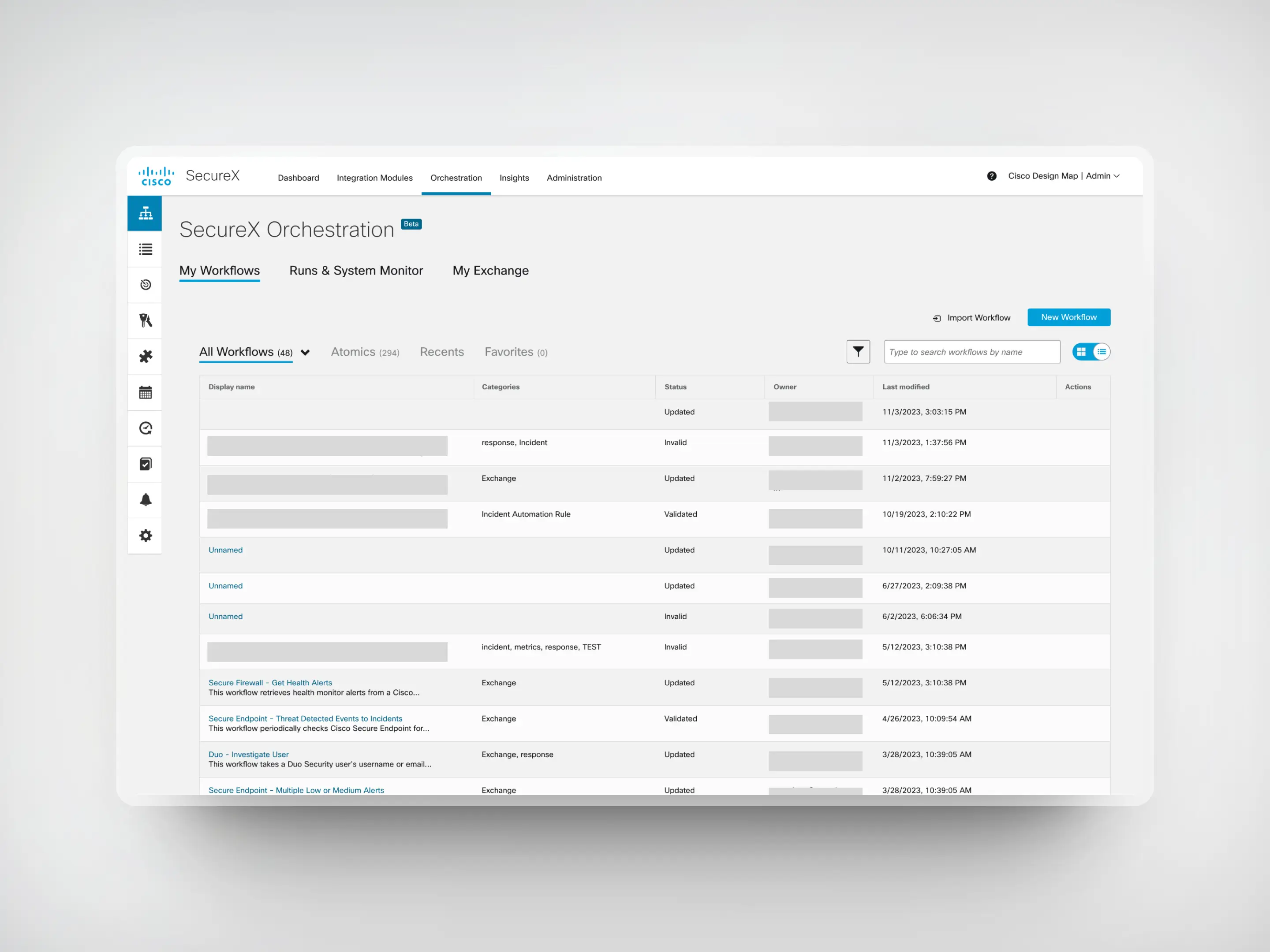
The cyber security company, Cisco, brought in our design team to revamp three product interfaces and improve how their suite of products works together for a more cohesive user experience.
Since these products were very similar in function and approach, they have been consolidated into this case study.
Problem
Overview
Cisco’s suite of security products aims for seamless interoperability within a company’s security infrastructure. However, the products, developed by different entities and integrated through acquisitions, suffer from fragmented user experiences, impacting the coherence and usability across the portfolio.
Product Ecosystem
What are the products that we redesigned?
01
Cisco Endpoint
Offers cloud-delivered endpoint protection and advanced EDR (endpoint detection response) across multi-domain control points.
02
Cisco Kenna
Identifies the vulnerabilities that pose a real risk to an organization so that it can focus its limited resources.
03
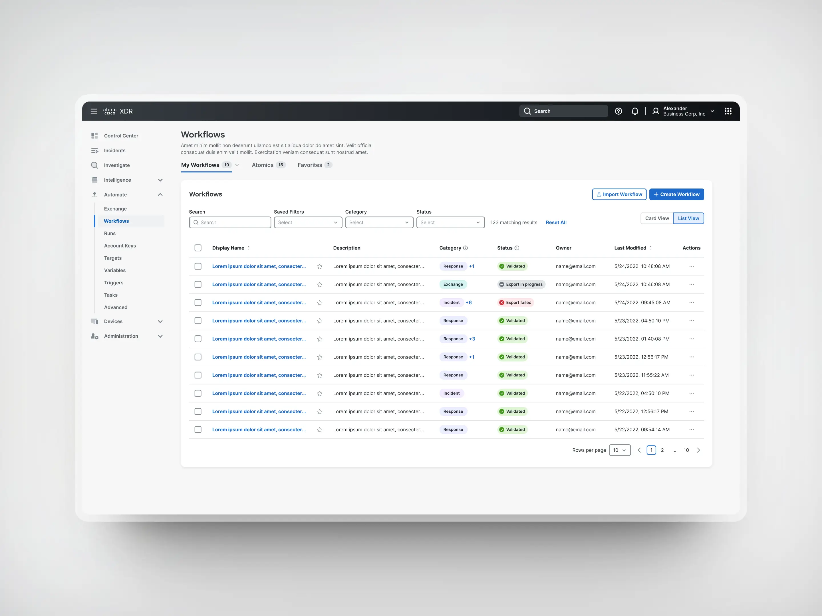
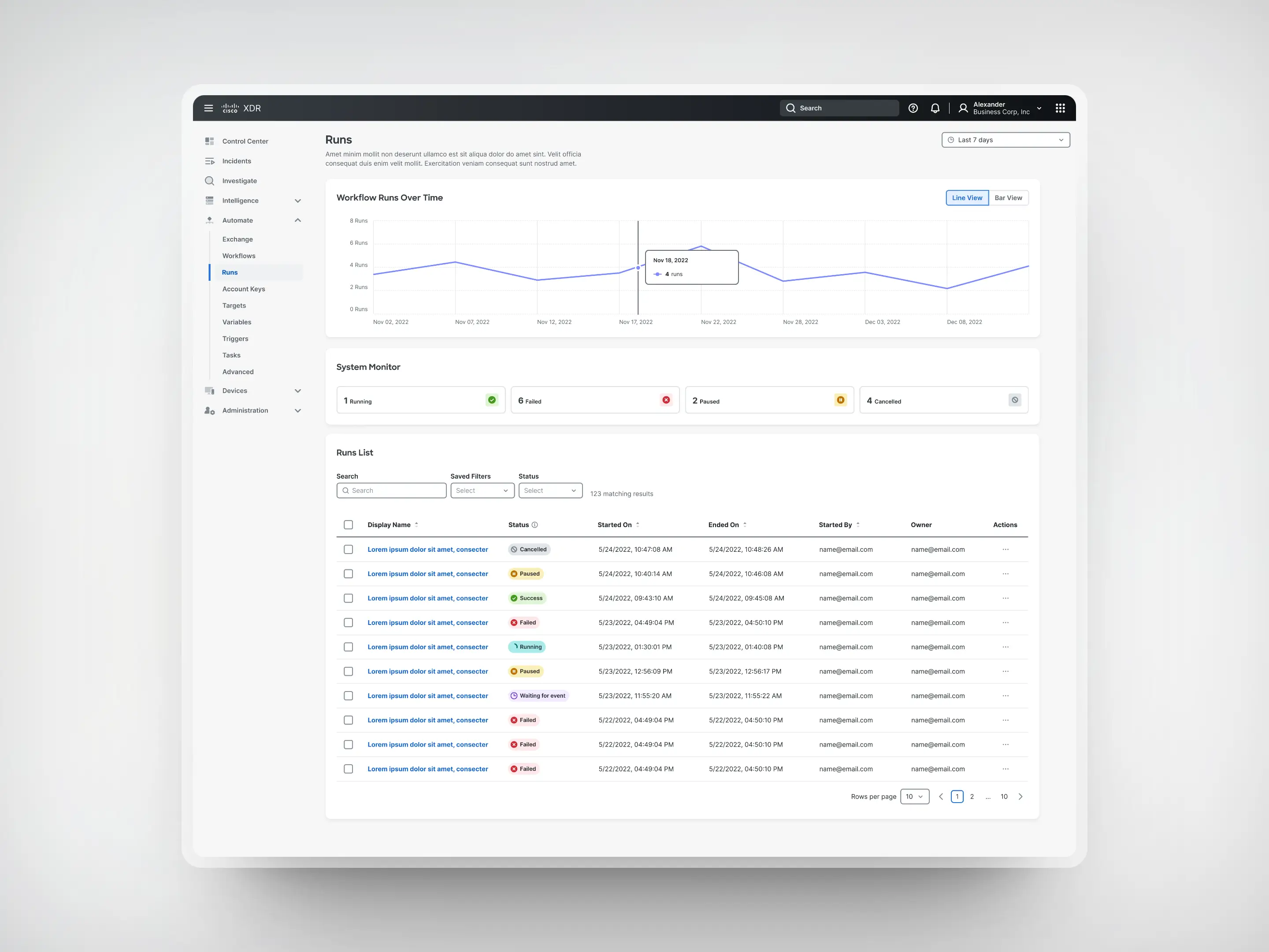
Cisco XDR
Extended detection and response (XDR) offers cross-platform visibility and uses analytics and automation for threat detection applications.
Our solution
Overview
We collaborated with Cisco to analyze these products and implement an updated design system applicable across several other Cisco products.
Recognizing the need for tailored solutions across these products, our approach prioritized familiarity and consistency. Rather than reinventing, we implemented design patterns in line with industry expectations.
With this set, we progressed with our approach using the double-diamond method.
Discovery
Evaluating the current experiences
01
Heuristic audits
I evaluated the applications using a slightly modified and modernized set of usability heuristics based on Jakob Nielsen’s general principles for interaction design.
02
Journey maps
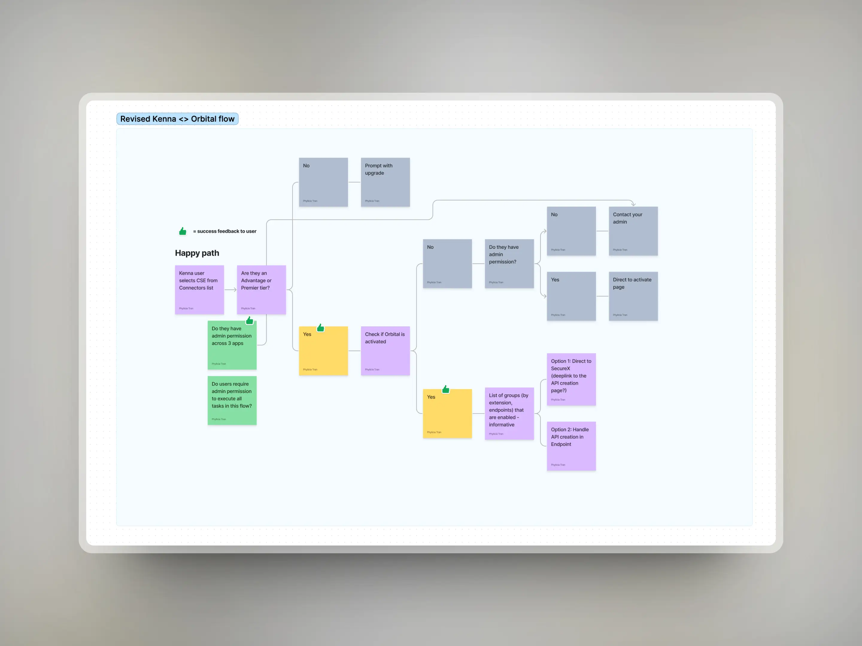
With the interfaces having design debt on different pages, it was essential to ensure that pathways were as streamlined as possible to remove friction when using the products.
03
Workshops
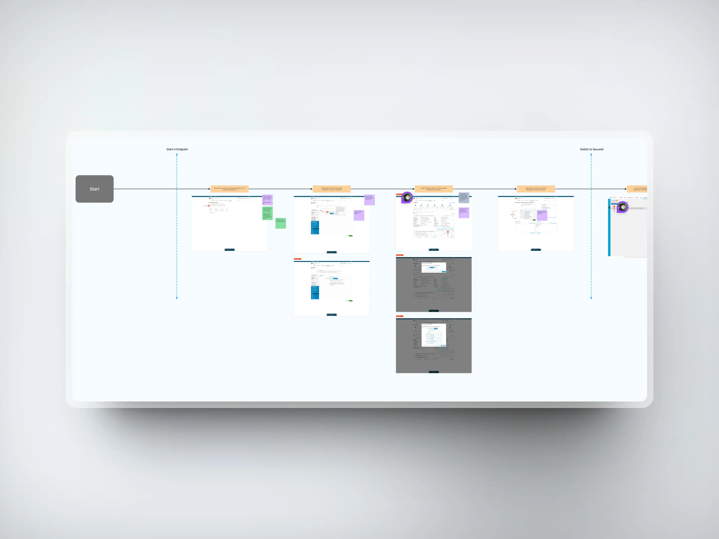
I conducted workshops with some of the product teams to understand product goals, uncover legacy knowledge of specific product features, and align on new design approaches.
Our findings
Discovery
During these discovery exercises, we garnered a vast wealth of knowledge into the nuance of designing within the cyber security space and learning about the pain points that users were facing. We discovered that some blockers were due to technical limitations rather than a lack of user experience and research guidance.
With this in mind, we started filtering through all the information we collected and funnelled it through Cisco’s established guiding principles.
Define
Designing the right thing
01
Task-based information
Access to product features and functionalities based on tasks users seek to accomplish.
02
Progressive disclosure
Give users the option and affordance to dig deeper and get more detailed information.
03
Adjust UI for both novice users needing explanations and experienced users who view them as unnecessary noise.
Our strategy
Define
Our strategy involved leveraging insights to create accessible layouts, enhancing functionality through the new design system, and refining user behaviours for greater intuitiveness, aligning with our established design principles.
Wireframes
Develop
As we jumped into the design process, I started by blocking out content structures for each key page to get a sense of the page flow and usability based on the live interface. This process was tightly knit with each product design team to ensure we were not losing any functionality users were accustomed to while applying our findings from the discovery phase.
Once our conventions were established, we started translating our low-fidelity wireframes into high-fidelity designs using the design system. These designs were then vetted during our design cycles with the Cisco design teams to collaborate and receive feedback.
Develop
Our design cycle
01
Design
To start a page, we would compare the current experience to our findings and map out a new structure that applies the design system.
02
Collaborate
We would then meet with the Cisco team to share our progress and brainstorm solutions for gaps in our redesigned pages.
03
Iterate designs
As the next steps, we would take their feedback and make changes to share in the following meetings until a solution is found.
Outcome
Delivery
Unfortunately, our contract with the client ended before launch and we were unable to test our designs with a vast range of users to fully validate our primary and secondary research.
Although we received positive feedback from each of the product teams, there are many ways we would have evaluated our new designs to ensure that they align with not only user needs, but also the established business needs from our initial discovery sessions.
We were able to hear that our work on Cisco XDR was featured in CRN's top ten cybersecurity tools of 2023.
Impact
How we would have measured success
01
Usability testing
Ensuring that users are able to complete tasks more efficiently, reduced error rates and ease of use.
02
User feedback
Positive feedback from user testing, surveys, or interviews regarding the impact of the redesigned interfaces.
03
Business impact
Decrease in customer support queries about how to use the products and an increase in adoption rate by new users.

Takeaways
Reflections
01
Pull the fluff
Initially, when starting the project, we wanted to introduce new features to show product growth, but we quickly realized that user familiarity with existing features was more critical than introducing novel functionalities. This led us to prioritize enhancing the usability of existing features.
02
Embrace constraints
Our reflection on embracing constraints influenced our shift towards agile thinking, enabling us to create simpler yet effective solutions for complex design challenges.


